Art Lesson 18
Discover Black Oil Paints in Transparent and Opaque Layers
Learn how to paint like the Old Masters!
Old Masters Academy Online Course
Self-study, self-paced online video courseLifetime membershipOne-time payment: $487Enroll Now!Personal Tutoring online + Online Course
Unlimited tutoring by the Academy teachersLifetime membershipOne-time payment: $997Enroll Now!« Back to the Art Lessons List
Black Oil Paints in Transparent and Opaque Layers
In this Video Lesson we will look at Black Oil Paints in Transparent and Opaque layers. Have you heard the opinion that real, true Artists shouldn’t have Black Colors on their Palette? That Blacks contaminate other Colors, and respected Artists should mix their own Blacks? Actually, this is true, with the exception of a few cases when Black Color is indispensable. But we will leave the explanation of these exceptional cases to the end of the Video Lesson.

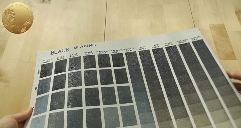
Now, we will test our Black colors making an illustrative Chart. Note that we will make two types of tests. In the first, we will Tint the Black Colors with White and apply them densely; the second test is for the same Black Colors only applied in thin Glazes. Black Colors play an important role in Underpainting technique. Just to remind you – Black is the one of the Titian’s Limited Palette Colors. Black Colors could be also effectively used in Glazes.
Use Worksheet #8 for outlining the guidelines on the support. Use masking tape to isolate the rows from each other. We need to prepare all Blacks we would like to test. In our recommended Oil Paints List, we have just three Black Colors, but if you have more Blacks to check, please do. We also need a White Color, as we are going to Tint Black Colors and create Tones from the very Black – here, you can see the 100% indicator of pure Black Color. Then, we add White in proportions of 75% Black to 25% White. Then goes 50/50 – half Black, half White. Then, we increase the White Color in the mix until it is almost pure White with just 2% of added Black.
For convenience, we write the names of the Black Colors above each column. So far, we need just temporary notes over the Masking Tape. Let’s look at the process – here is our pure Black color applied as it is, strait from the tube – 100% Black Color. Then, gradually, we tint up the Black Color with White.
We apply the Paint in such a way that one side of the swatch has impasto texture. As you can see, the Paint is applied in thick strokes, and from the other side, the Paint is coated in a dense covering layer.
This part of the exercise could be completed quite quickly in one session. After this, we proceed with the second part of the exercise – testing Black Colors in thin Glazing layers. Beforehand, we covered the columns designed for the Glazing exercise with an extra coat of White paint. Our original support was a bit off white, but for Glazing purposes, we want to have an absolutely white Background. As you can see, this area is designed for opaque and densely tinted coats of Paint, and didn’t need to be covered with extra white, as this wouldn’t affect the result. But in case of Glazings, the whiter the Background is, the more intense the result of glazing will be.
As you remember, to create a glaze layer we need to dilute the Paint with some appropriate Medium. In our case, we have chosen Liquin. Unlike other Mediums traditionally used in Glazing, it substantially reduces drying time. We also do not add any White here. We just have Pure Black Paint diluted with Liquin. You remember how we applied glazes – first, spread the diluted Paint over the surface. Then, smooth it out with a Wide Flat Synthetic Brush. Yes, we also need to fill in the upper row of the columns with pure, undiluted Paint.
At a time we apply the second layer of glaze, the first one should be entirely dry. The very next day, such glaze layer can be touch-dry, but I recommend waiting at least 3 days before applying the new layer. Please note that these time frames are applied only for fast drying Mediums as Liquin, which we are using now. If you decide to use oil based Mediums like Stand Linseed Oil, you should bear in mind that the drying time could be increased at least twice. (This also depends on the drying characteristics of each Pigment).
The second layer of the glaze is applied. Again, the Chart could be set aside for few days for drying. To make your task easier, you can lightly draw guide lines indicating where the Glazing layers should be positioned. We have divided the Glazing column into 11 steps – The first step contains one layer of glazing, the second – two layers of glazing, and so on. On step 11, we actually reached the maximally dark Tone that each Color could reach. The transparency of the Color usually disappears under numerous originally transparent layers.
We are usually not interested in reaching such darkness on Black Colors through Glazing. Usually, very gentle Black Glazing layers are added in paintings of Old Masters to add cold nuances and make the Tonality a bit darker. You can feel that there is Black added into Glazes of skin in Rembrandt’s portraits, as admixture, in quite homeopathic doses; chemical analysis has also shown that fact. It was proven that he used such Black Pigment as Charcoal in his portrait paintings.
But you never see deep passages in Rembrandt’s or Caravaggio or other Old Masters’ paintings, except in some extreme cases as in some of Ribera’s paintings. The paintings of Old Masters who are famous for their extremely contrasting tones called “Chiaroscuro.” In most cases, the deepest shades we take for Blacks are in reality glazed Brown Paints – Brown Earth Colors. Old Masters never used Black Colors in their deep shadows; however, from first glance, they seem quite black to us. Some artists may assume that the enormously attractive effect of a contrast is achieved thanks to Black passages. This erroneous conclusion leads to the popular mistake of overusing Black in shadows and the Background.
Please do not think I’m a bully and pointing to the other artists’ mistakes; I made the exact same mistakes. This was one of my artworks from my student years: I sincerely couldn’t understand why my attempts didn’t create the effect I expected. The effect I saw in Caravaggio or Rembrandt’s paintings. My painting refused to create the same wonderful impression of deepness. Now, I know what was the stumble stone. What I assumed was a black background on Old Masters’ artworks – was actually never painted with Black Colors.
Black Color is a deadly poison when you use it in places that should be airy, have an airy perspective, and be able to show the deepness. On the contrary – Black Colors have a tendency to make everything flat and dead, especially when we tint it with White.
I am strongly advocating the use of Tinted Black mix in two cases only – first, in Underpainting, which is going to be glazed over, with Warm Colors, anyway, and in such way to be aesthetically ennobled. And secondly, Tinted Black mixes suite brilliantly for depicting Black clothing. Pay attention to the Old Masters – in works of Titian, Rubens, Frans Hals, Rembrandt and other Masters. They depict Black draperies, hats, clothes, and dresses in Alla-Prima. Very simply, with no other added Colors, just Black and White for tinting in highlights.
Exceptions happened, I guess, but they are so rare that I couldn’t even find a proper example. So, we can probably tell that there is such a common established rule; if literally all Old Masters followed that rule, it means that it was working 100%, and there is nothing to reinvent. I propose to adopt this rule to our practice as well.
Let’s consider Frans Hals, the most “black and white” painter of all Old Masters. His overuse of Black and White Colors is striking – however, with thoughtful examination of his paintings, we reveal the following: yes, he painted clothing in a “naked” Black-and-White manner, however, all other surroundings are not as simple – he also used glazes and breathing Warm Backgrounds.
What else can we see on this Chart? That Black Colors could also be divided into Cold and Warm Categories. Payne’s Grey is a very Transparent and Bluish Paint, appearing Black only in thick coats or after the multiple layering of glazes. Compared to it, all other Black Colors look Warm. But if we are going to compare Blacks between each other, we can see that Ivory and Mars Black are Warmer than other Blacks. This is clearly visible in both Glazing and Opaque Swatches. When we chose what kind of Black Colors should be on our Palette, our choice fell on one completely Opaque Mars Black, which is included in the Titian Limited Palette – it is ideally suited for Underpaintng, and we also had to choose a Transparent Black Color – Charcoal Grey- that is perfect for Glazings and could be efficiently used as admixture to the skin tone in tiny quantities. These two Blacks also differ in temperature – Mars is Warm, and Charcoal has a Cool appearance.
In our recommended Oil Paints List, we also have Payne’s Grey in addition to Mars and Charcoal. All Colors in the Palette were chosen based not only on their aesthetic look, but also on the endurance characteristics of the Colors.
What you need for the task:
- Worksheet #8
- Prepared Support – Canvas, Canvas Board or Oil Painting Paper A3
- Masking tape
- All Black and Grey Colors you want to test
- Hog or/and Synthetic Brushes + Wide Flat Synthetic Brush for smoothing
- Palette Knife
- Liquin Original


