Art Lesson 8, Part 3
In this lesson, you will discover Earth Colors for Oil Painting
Learn how to paint like the Old Masters!
Old Masters Academy Online Course
Self-study, self-paced online video courseLifetime membershipOne-time payment: $487Enroll Now!Personal Tutoring online + Online Course
Unlimited tutoring by the Academy teachersLifetime membershipOne-time payment: $997Enroll Now!« Back to the Art Lessons List
Earth Colors for Oil Painting
Earth Pigments
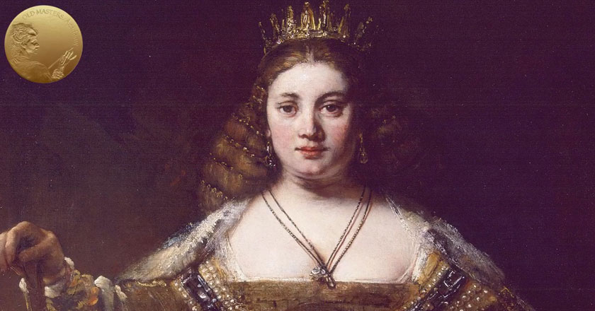
Now we have reached the earth color pigments on our palette. These are pigments that were used since the time of cave artists till today. Absolutely all your favorite Old Masters relied on earth colors such as Ochres, Umbers and Siennas. It doesn’t sound too impressive to have browns on the palette; but look at Rembrandt and you will see how it’s possible to make masterpieces using earth colors. You do not need any exotic pigments, just familiarize yourself with these earth pigments and use them to their maximum potential.
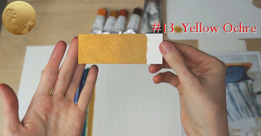
13. Yellow Ochre
Yellow Ochre is a Very Fast Drying semi-transparent pigment. Ochre hardly needs an introduction – it is the most reliable pigment and an absolute “must have” color for most artists’ palettes. It is fantastic paint in all respect, although it has quite a humble look. Yellow ochers have different shades; but in general, they have a close to mustard or brownish yellow.

Yellow Ochre has good covering power and high tinting strength. It works well in places you have to overpaint. The paint is durable in all respects, it creates a strong mixture with all colors. However, Yellow Ochre oil paint may darken. This could be mainly due to the pigment’s natural tendency to absorb a large amount of oil. Knowing this, try not to overdo it by adding too much oil (linseed or walnut oil) when painting. Yellow Ochre is a part of the Limited Titian Palette.
14. Yellow Ochre Deep
A Very Fast Drying and Transparent Ochre. This is a synthetic paint with a beautiful rich shade and very dense warm undertones. Yellow Ochre Deep works perfectly as glazing paint. It can create intense and glowing transparent layers.
15. Transparent Gold Ochre
Despite the fact that its name contains the word “transparent”, it has a semi-transparent nature. Ochers are reliable paints, as proven over thousands of years since the time of cave artists. Transparent Gold Ochre is just one of many Ochres you can choose from, depending how attracted you are to the undercolor. This Ochre has beautiful warmth with a gingery undercolor. It has good tint power which makes whites and other yellows look amazing, with an added golden, warm, and rich tone.
16. Raw Sienna
A Very Fast Drying paint. Raw sienna is a yellowish brown natural earth pigment used from cave art till today. Thanks to the exceptional permanency of the pigment, cave art still looks the same as it did on the day of creation. Raw Sienna has exceptional transparency and therefore is an excellent glazing paint, it gives a golden tan to thin layers of glazing. However, it doesn’t look attractive when applied thickly as impasto – the paint could sink and dry unevenly resulting in a dull and unimpressive surface. It can be successfully used as a ground tone in Imprimatura or Underpainting as many Old Masters used it. As the name “Raw Sienna” suggests, it takes its name from the city-state of Siena, where it was produced during the Renaissance. Sienna, in its natural state, is a modest looking yellow-brown paint. After heating, it becomes reddish and is called Burnt Sienna.
17. Burnt Sienna
A Very Fast Drying and transparent pigment. Burnt Sienna plays a prominent role in oil painting and it is a necessary part of your palette. As we just mentioned, it is made by heating Raw Sienna. It has a red-brown, more of a brick red tone, that is especially attractive when used in glazing technique. Such glazes give clear and beautiful thin layers. However you should avoid painting in thick layers as this can mess up the painting. When applied opaquely, thick layers can make the painting dull and unevenly matted. Mixing Burnt Sienna with Ultramarine Blue, you will get an excellent black color, an alternative for purchased Blacks. Such mixes are colorful and have a pleasant tone. Burnt Sienna’s tint power is strong. I value its brilliant color and characteristics so much, that I definitely name it my favorite paint. This color helps me create transparent warm shades in the flash and portraits… and I use it all over the place on paintings.
18. Burnt Umber
This is a Very Fast Drying pigment and works as a dryer in mixes due to its manganese content, which also gives the paint its dark color. Burnt Umber has a heavy and slightly greenish undertone; it is dense, high in tinting strength and it has excellent hiding power. Burnt Umber is made from natural brown clay found in earth. It was named after Umbria, a region in Italy where it was mined. Burning the raw pigment intensifies its color. This color was used in Underpainting for centuries. It was also used in antiquity. Mixed in different ratios with Ultramarine Blue, rich and deep colorful blacks are created and they can replace black pigments.

19. Venetian Red
Venetian Red is an opaque Very Fast Drying deep red pigment. It’s a heavy warm red earth pigment with a slight tendency towards orange. Formerly a natural Iron Oxide, this is now manufactured as synthetic Iron Oxide with greater standards of purity. You can be confident that this color will remain the same as you apply it because the paint is highly reliable, stable, and absolutely lightfast. It belongs to the group of inexpensive pigments. Venetian Red was named after the quarry, near Venice, where Titian sourced his earth reds. Venetian Red was also known as Red Ochre. And, of course, Venetian Red is a part of the Limited Titian Palette.
20. Mars Black
There are artists (including me in the past) who do not recognize any Blacks on their palette. It is up to you to decide whether to use Black paints or mix them from available paints from your palette. I have chosen two Blacks for my palette that have different qualities and abilities. You need to learn how to deal with Blacks to allow them to enrich your painting. However, using blacks often lead to disappointing results. This occurs because many artists use random black pigments and use them in the wrong way. In further Video Lessons we will show you how to use Black paint efficiently.
Mars Black, the first Black paint on our palette, is a Fast Drying pigment. The most obvious difference between Blacks is the undertone nuances of the paint. Mars Black is slightly warm and dries very mat compared to other Blacks.
Mars Black is very opaque; for that reason it is perfect for direct painting which was often used by the Old Masters for depicting black draperies. Mars Black has very good hiding power and great tinting strength; when mixed with all other colors, it literally influences the mix. It was developed in the beginning of the 20th century. Because of its fast drying quality, it’s perfect to use it as an Underpainting color and it is a part of the Limited Titian Palette.
21. Charcoal Grey
Fast Drying paint. As you can guess by its name, it is made from ground charcoal. It is a dark grey-black oil color. It has an excellent reputation of being a reliable paint. Charcoal Grey as well as Payne’s Gray is more appropriate for achieving black shades with glazing rather than painting in opaque layers. Charcoal Grey was found in Rembrandt’s portraits. As well as in Rubens’ paintings in the blueish-grey color of flesh tone.
22. Payne’s Grey
Can be easily mixed by yourself by combining Ultramarine Blue and Burnt Sienna or by mixing Ultramarine Blue and Black. It also can be produced using other pigments. Just experiment and you will get a wide range of grays quite similar to Payne’s Grey.
So, you can premix the color yourself, or acquire it already premixed. Payne’s Grey is interesting in figurative painting; it gives cool nuances to flesh. It is a Semi-Transparent paint with a blackish blue undertone. It is not considered to be black, but when applied in layers, it can provide a range colors from transparent grey to pure black.
I find it looks great when used as a glazing Color. It can be fully appreciated in this painting. The dress shades was glazed here using this wonderful paint.
Vandyke Brown
I would like to mention one very popular Color, that is not included on our Palette. This is – Vandyke Brown.
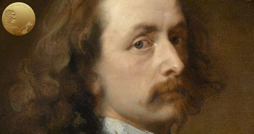
This nice-looking pigment was known during the Renaissance and was used by the Old Masters. The pigment originally had other names. Later, it was renamed after the great Anthony van Dyck, who was particularly fond of using this color. The pigment was extensively used, and still is. Today, artists are psychologically attracted to the name of the paint, subconsciously associating the great artist with the properties of the paint. The so called “halo effect” occurs. In reality, Vandyke Brown paint has bad characteristics and I do not recommend you to use it. When mix it with Whites its warm tone changes into a cold one; it fades under the influence of light, and its tint changes over time. Why is such an unreliable paint on the market? As profit oriented manufacturers admit, they produce the color because there is a demand for it. By the way, the same happens with Alizarin Crimson that has exceptionally bad characteristics, but is still for sale.


