Art Lesson 23, Part 2
Discover Harmony and Contrast in Painting – Related and Complementary Colors
Learn how to paint like the Old Masters!
Old Masters Academy Online Course
Self-study, self-paced online video courseLifetime membershipOne-time payment: $487Enroll Now!Personal Tutoring online + Online Course
Unlimited tutoring by the Academy teachersLifetime membershipOne-time payment: $997Enroll Now!« Back to the Art Lessons List
Harmony and Contrast in Painting – Related and Complementary Colors
Well, now we have to understand how can we use our knowledge of Primary and Secondary Colors. The knowledge of Color potential and the interaction between them can dramatically increase the ability to manipulate the Color, rendering Colors – not blindly, but with a high level of prediction of what Color and Tone you can get as the result.
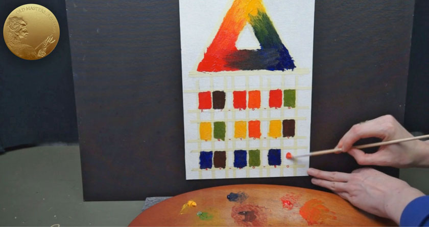
Have a look at these Color pairs we have divided into two categories – Harmony and Contrast categories. Primaries and Secondaries, these 6 simple basic Colors, can form harmony or contrast effects when interacting with each other. The Color itself, on it’s own, cannot produce an impression of harmony or contrast. We need at least one more color for that.
Color Harmony is a combination of two or more Colors, forming an organic unity that affects us aesthetically.
These 6 pairs illustrate Colors that we call Related or Analogous Colors. These are adjacent Colors on the Color Triangle. In painting, they create an incredible harmonious feeling. It could be explained scientifically – they are reflecting similar light. Red and Violet compose a harmonious pair. Let’s go from Red to the opposite way, towards Orange – again, an ideally harmonious pair. We can guess now that with the color Yellow, we can choose Green, or form another harmonic pair with Orange. And, with Blue, we can choose either Violet or Green.
Harmonious Related Colors could be expanded further from a pair of two into a group of three. As an example of this, Blue can be added to the Red and Violet pair because it is also harmoniously related to Red and Violet, creating a family. So, we can create a harmonious chain of Colors from one Primary to the next one. See, the Colors along each side of the Triangle form a very harmonic combination. But, anyway, the closer the Colors are to each other, the stronger the feeling of harmony. When we go around the corner – like that: from Red, Violet and Blue to Green, we will cancel the harmonic sequence. In this harmonic chain, Green is not a Color Related to Red. Because Red and Green are Opposite Colors, they are the most contrasting Colors to each other.
Contrasting Colors, also called Opposite or Complementary Colors, are Colors that lie strictly opposite to each other. There are three Complementaries – for Red, the complementary Color is Green; for Yellow, it is Violet; and finally, Blue and Orange form the third Contrasting pair.
When we want to enhance any of these Primary or Secondary Colors in the painting, we have to place them next to their Complementary Colors. When Complementaries are placed side-by-side, let’s say Red and Green, such a neighborhood makes them look even brighter and more intense. When Complementary Colors are mixed together, they result in Tertiary Colors. We will see the result of such mixtures in the next Video Lesson. When Opposite Colors are mixed together, they cancel the intensity of each other and result in different sorts of Dark Colors – Brown, Grey or sometimes Black.
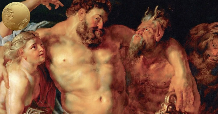
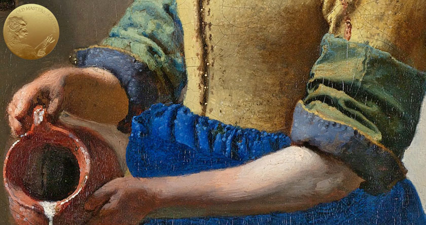
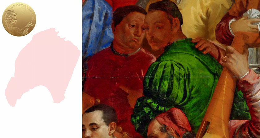
We already know how to make some Color stand out. The Old Masters used this interaction of Opposite Colors quite often and exquisitely. Have a look at how Opposite, Complementary Colors reinforce each other and lead to a highly colorful, brilliant effect.
We can also can make the completely opposite effect – instead of enhancing a Color by placing next to it a Complementary Color, we could neutralize the overly-dominating Color in the painting. For example, if we need to mute down some exceedingly dominating Color, the better way to do that is to glaze it over with a Complementary Color. Keep the layer of Glazing fine and transparent enough just to mute off the excess brightness. The Color itself remains as it is; however, it will be muted down and stop dominating. For example, if this Green is too dominating, glaze it thinly and very transparently with Red, Green’s opposite color, and you will mute the aggressive domination of Green without changing the color itself. So, as you see, we can efficiently juggle with Complementary Colors and make them work for us, to our benefit.
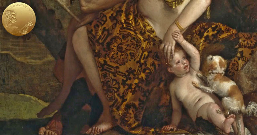
If Artists who don’t know what Primary and Secondary Colors are and how they work with each other, they could waste a lot of Paints in attempt to mix the right Color. It’s very easy to add the wrong color to the mixture, making it muddy or somehow looking questionable.
The Color Triangle could be divided into two nominal sections, Colors in one part are classified as Warm Colors, and the other part consists of Cold Colors. Actually, when looking at a Color Wheel, it’s even more understandable how the Wheel could be divided. But we all usually know what it means to be a Warm or Cold Color. The Red, Orange, Yellow and Yellow-Green colors are referred to as Warm Colors, in association with the color of sunshine or fire. And the Blue-Green, Green-Blue and Violet colors, which we usually connect with the moonlight, ice, water, are referred to as cold colors. This division between Warm and Cold Colors is nominal. Colors may have different temperature nuances within one Hue and appear warmer or colder in comparison to each other. For example, within the Red Hue, a Red that has a slightly bluish cast appears colder than an orange Cadmium Red.
But, did you know that Warm Colors affect the spacious perception of the painting? While Cold Colors have the tendency to move away, recede and feel like they are deeper than they really are, Warm Colors seek to excel, to come out and leave Cold Colors behind. It could be explained by what we see in nature – all distant objects look lighter and bluer than they are when we see them at a closer distance. So, our eyes automatically move Colder Colors further from us. That is how Atmospheric or Aerial Perspective tricks our perception. Thanks to the blue light scattered in the air, at a great distance, the color of objects becomes colder. Additionally, there are changes as a result of lightness as well – dark Colors look far lighter, and light Colors, on the contrary, seem darker.
The concept of Warm-Cold relations of Color enriches our observations of nature and gives us extra vocabulary in describing Colors.
It is important to use both Cold and Warm Colors in the painting. The painting should be balanced to get the harmony between Cold and Warm Colors. If the painting has only dominating Warm Colors, it will not really work. Even if the painting is already executed in Warm Colors only, you should add some Cold nuances into the painting – some passages, or just dubs of Cold Color.
The same is necessary when we have a painting executed exclusively in Cold Colors, though this occurs less often.
What you need for the task:
- Worksheet #13
- Prepared Support – Canvas, Canvas Board or Oil Painting Paper A3
- Masking tape
- Any Yellow, Red and Blue Colors
- Hog or/and Synthetic Brush
- Palette Knife
- Liquin Original
