Art Lesson 47, Part 6
Discover How to Paint a Portrait in the Direct Method
Learn how to paint like the Old Masters!
Old Masters Academy Online Course
Self-study, self-paced online video courseLifetime membershipOne-time payment: $487Enroll Now!Personal Tutoring online + Online Course
Unlimited tutoring by the Academy teachersLifetime membershipOne-time payment: $997Enroll Now!« Back to the Art Lessons List
Hyper-Realistic Painting Technique – Trompe-l’œil
Now we’re going ahead with the final part of the painting. In the middle of the artwork we’re painting a sheet of paper attached by packing tape and a sticky post. We are using a painting method that allows us to create the illusion of a real sticky post attached to the painting.
The name of the method is “trompe l’oeil,” which is French for “deceive the eye.” It is an art technique involving extremely realistic imagery in order to create the optical illusion that the depicted objects are three-dimensional.
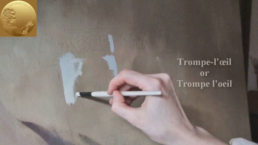
Our task here is to make a very realistic image of a three-dimensional sheet of paper on the two-dimensional surface of the painting canvas. The canvas surface is touch-dry and we’re making the drawing of the paper on the canvas in charcoal. The paper is painted with an uneven layer of paint so it creates the effect of slightly crumpled paper. Two tints are mixed for this purpose – Titanium White and Burnt Umber with the addition of a little bit of French Ultramarine. One tone is prepared a bit lighter and another is a bit darker for painting the corresponding light and dark areas of the paper. The soft brush is used to fuse all paper tones together so that no void areas are present.
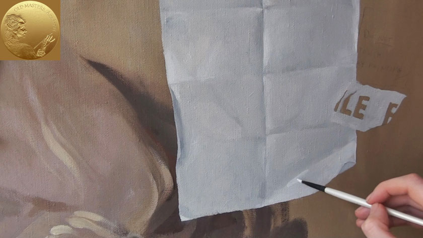
The small details are being painted – the small brush is used for paper highlights next to the very edge of the paper fold. Then using a soft, flat brush, these highlights are being spread out so they gradually mix with the paper color.
Trompe l’oeil was used as long ago as Greek and Roman times.
For instance in Pompeii a typical trompe-l’œil mural might depict a window, door, or hallway, intended to suggest a larger room.
With the superior understanding of perspective drawing achieved in the Renaissance, Italian painters such as Andrea Mantegna began painting illusionistic ceiling paintings, generally in fresco, that employed perspective and techniques such as foreshortening in order to give the impression of greater space to the viewer below.
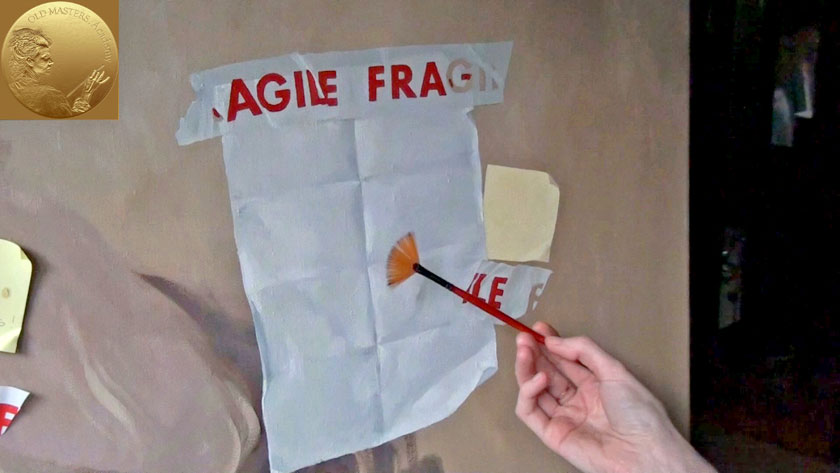
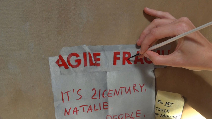
The packing tape is as white as the paper, but because it is semi-transparent, the brown background is slightly visible beneath the tape. This semi-transparency also needs to be depicted.
Now we are able to proceed with the next step – writing characters on the packing tape. For this purpose Scarlet Lake and Alizarin Crimson are mixed together to achieve the deep vibrant red color. This task is quite mechanical and requires accuracy above all to achieve the realistic appearance of the word “Fragile.”
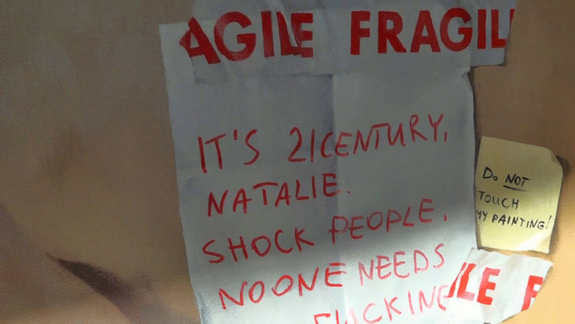
This is the fun-brush with soft synthetic hair. Using this fun-brush we can easily smooth the surface of the paper, so no brushstrokes remain visible. We can leave the work to dry after this step.
The text is painted on a completely dry layer of the paper to avoid intermixing the red of the characters with the white of the paper. The cast shadow is painted next to the paper. The light comes from top-left; therefore the cast shadow lies at the bottom-right of the paper. The shade needs to be transparent, so the brown background is visible through it. The best approach in this case is glazing.
We have painted light shades and now we continue to build up glazing layers to darken the area around the paper. As you remember, every new glazing layer should be painted only on top of a completely dry layer. This is a time-consuming procedure, but the final result will be worth it. You may not achieve the same transparency and realistic appearance by simply making cast-shadows with darker opaque paint in one go.
We are using Raw Umber together with Payne’s Gray, mixed with Liquin Original. The glazing starts from the paper’s edge and is gradually spread out by the brush. The glazing layer should always be soft, without visible brushstrokes. The further the shade gets from the paper’s edge, the lighter and more blurred it becomes.
In some places the written text need to be touched up again to achieve a darker color. This applies to those parts of the text on darker areas of the paper.
This is the final result of our painting. The completed artwork illustrates the great difference between various painting techniques used on the same canvas.
