Art Lesson 8, Part 4
Discover the Old Masters Academy’s Oil Color Palette
Learn how to paint like the Old Masters!
Old Masters Academy Online Course
Self-study, self-paced online video courseLifetime membershipOne-time payment: $487Enroll Now!Personal Tutoring online + Online Course
Unlimited tutoring by the Academy teachersLifetime membershipOne-time payment: $997Enroll Now!« Back to the Art Lessons List
Old Masters Academy’s Oil Color Palette
With time, when you will acquire all necessary Oil Paints, I advise you to create a Color Chart, such as this one, to use as a reference tool.
Please print out Worksheet #15 and outline the guidelines. Fill in the cells with the colors we want to test. In the next section, we have a Video Lessen called “How to prepare Canvas for Oil Painting” which explains how to prepare support for this exercise and how to use our Worksheets.
Let’s have a look at our Palette. What Colors do we have at our disposal? First of all, they are chosen not only for their visual appearance, but also for durable characteristics.
We have triplets of White, Yellow, Red and Blue-Green Colors. Each triplet has colors with different transparency and a different warm-cold relationship. The exception is the Blue-Green triplet – they all are transparent.
Next goes Earth Pigments, at least the majority of them are Earth pigments. We then complete our chart with the triplet of Black pigments.
For the Chart, you will use the following identifications: The upper case “T” indicates that the color is in the “Limited Titian Palette“. The big grey dots indicate the most essential colors you need to have – key colors. Then we see four icons identifying transparency of the color. And with “A” and “AA” (double A) we identify how permanent the color is.
After you create the Chart, you can also do the following test: To test how the colors from the palette will perform in years to come, we will fold the Chart in half and completely isolate one part of the palette from the light, and the other part will be exposed to the daylight, or if possible to sunlight.
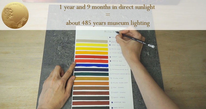
You should definitely follow this example to test the colors you will rely on. If any paint misbehaves – it would be wise to replace the brand.
Write down the date when you have done the Chart.
The amount of time required to test the paint in direct sunlight has been discovered. It turns out that the effect of direct sunlight on paint during a period of a year and 9 months equals the effect museum lighting has on paint for about 485 years. In about two years, I’m going to make a special report based on the results of the experiment.
One more typical question is How to choose Oil Paints for Glazing.
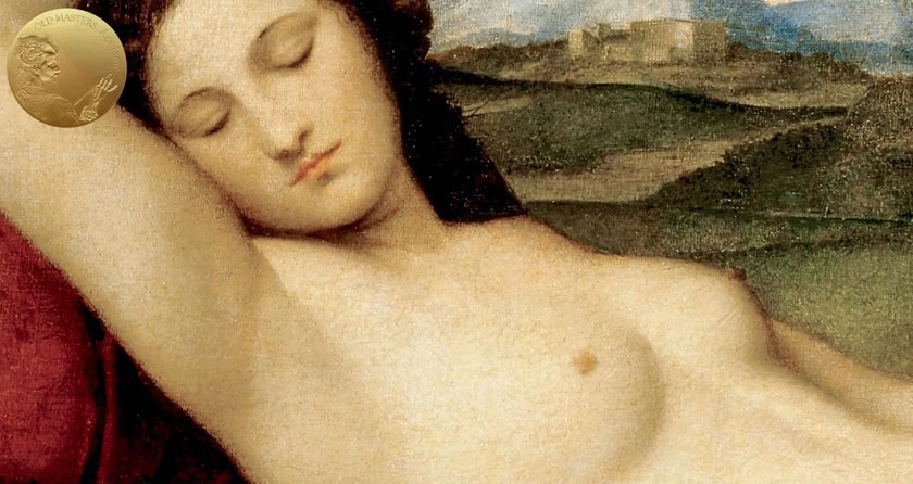
All paints can be divided into two groups: Covering and transparent Glazing paints. The transparency label on the tube helps you understand this.
With time, you will memorize the transparency abilities of each paint you use. The transparency / opacity of paint is constant no matter which brand you prefer. For example, Titanium White is always opaque, but Indian Yellow is transparent regardless of the brand you choose.
Unlike opaque paints, glazing paints have very weak covering power. Cold transparent colors look very dark in thick layers. Have a look at these transparent colors: Warm Indian Yellow is exceedingly transparent even when applied as Impasto; while cold Phthalocyanine Blue is quite black in a thick application.
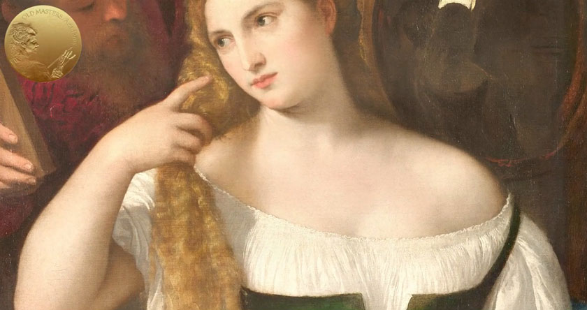
Usually, only transparent paints are considered suitable for Glazing. This is the absolute truth in case you want to create a clear and deep color. Using opaque or semi-opaque paint can kill this effect. However, there are endless opportunities to use opaque or semi-opaque paints in glazing especially when painting flesh. When you glaze with opaque paints you need to add more glazing medium and just a tiny amount of opaque paint to get a relatively transparent glaze. Deciding whether to glaze with transparent or opaque paint depends on the result you you want to achieve. There are a few rules that should be kept in mind – for shadows you should avoid opaque paints; we have to keep shadows transparent to create depth. This rule doesn’t apply to flesh painting, where shadows can be created with both methods – as absolutely transparent glazes, and also as semi-opaque glazes (foggy glazes) called Velaturas.
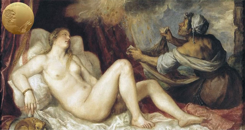
If you restrict yourself by using only transparent colors for glazing, you can miss a lot of opportunities to reach new interesting painterly effects. As Titian advised to his apprentices – do not be afraid of making the colors muddy, but deliberately make them muddy. As you may notice – Titian’s works are not pedantically clean in colors, on contrary – many of them could be called dirty. But what an outstanding picturesque effect they produce!
So, to summarize: Use Opaque Colors with good covering power for Underpainting. Use both Opaque and Transparent Colors for Glazes and Velaturas. For the skin use both, for places that need to be intense and deep in Color use only Transparent Paints.

