Art Lesson 38, Part 22
Learn about Rembrandt’s Principles of Portrait Painting
Learn how to paint like the Old Masters!
Old Masters Academy Online Course
Self-study, self-paced online video courseLifetime membershipOne-time payment: $487Enroll Now!Personal Tutoring online + Online Course
Unlimited tutoring by the Academy teachersLifetime membershipOne-time payment: $997Enroll Now!« Back to the Art Lessons List
Rembrandt’s Principles of Portrait Painting
Before the age of photography, portrait painting served multiple purposes – portraits were mass-produced by art assistants for the mass-market as well as painted by well-known artists for art collectors. Nevertheless, even famous artists did not always complete artwork with their own hands. For example, Portrait of Philips Lucasz of 1635 features the head and the background painted by the master himself, while the lace collar and gold chain lack virtuosity and probably were painted by his assistant.
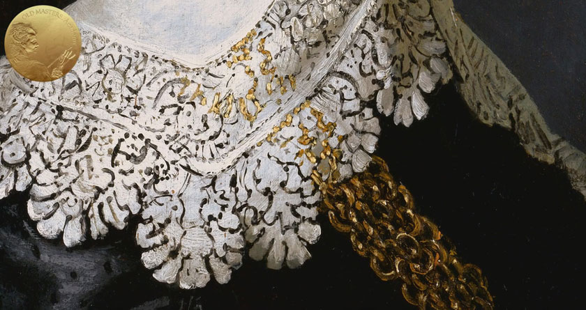
From around the 1630s, Rembrandt brought new style to portrait painting. His technique and style differed from portrait painters of that time (such as Van Miereveld and Van Ravesteyn.)
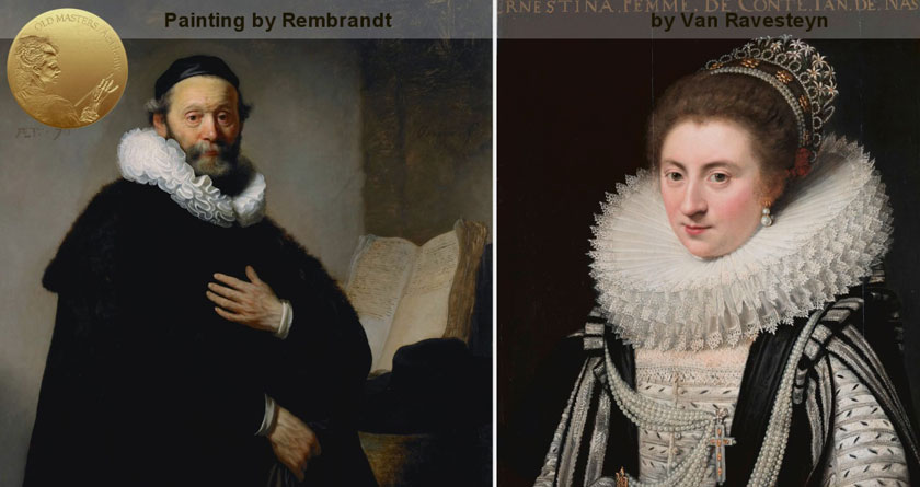
Rembrandt’s portraits are a reflection of feelings and captured moments rather than a simple depiction of a sitter. Such style is present not only in smaller bust-size portraits, but also in full-length and knee-length paintings.
After moving to Amsterdam, starting from his very first portraits, Rembrandt established himself as a recognizable portrait painter with a unique view on composition (Portrait of Nicolaes Ruts). Another portrait of that period – Man at a Writing Desk also puts into focus feelings and action.
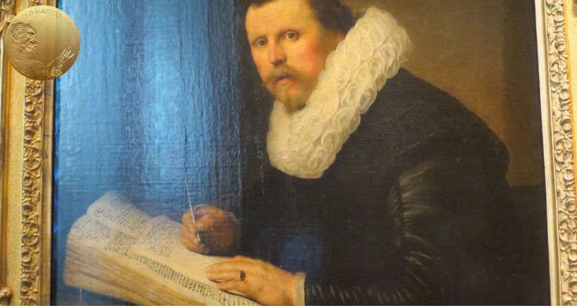
Here’s one more dynamic portrait painted in 1633 – Portrait of a Young Man Rising From his Chair (Taft Museum, Cincinnati).
Such attention to action comes from group portraits painted in Amsterdam by his contemporaries. Rembrandt used a similar approach for single portraits.
At the same time, the rectangular bust portraits by Rembrandt remain closer to traditional composition, where the head of a sitter is located in the upper-half of the canvas.
In the oval portraits, the placement of the head and its scale varies from portrait to portrait. As a general rule, the chin is just below the middle and above the head, there is a fair amount of background. Here are two portraits painted in 1632 – Portrait of a 40-year-old Man (New York) and Portrait of a Young Man. Each show different approaches used in composition.
In his portraits of the 1630s, Rembrandt put the main focus on the sitters’ faces. He also brought white collars into attention, especially in male portraits where the sitters are facing to the right and the collars are tilted, balancing the lit areas of the portrait. The white surface of the collar reflects light and contrasts with the faces and backgrounds. Reflection of this light was usually done in cool, opaque grey over translucent brown colors of shades. In female portraits, sitters usually face the left and large flat ruffs or lace collars also reflect light and play an important role in the overall tonal balance.
There are certain methods Rembrandt used when portraying facial features. Often, he merged the corner of the mouth-line into the shadow. The border of the upper eyelid was sometimes painted in with a small stroke of brown paint; such a line suggests the shadow of the upper eyelid fold. The lower eyelid is mostly in shadow.
Rembrandt painted transitions from light to shadow with great attention. For such passages, he used transitional tints of cool grey that blended into warmer brown, thus creating an interesting pattern.
It is interesting that Rembrandt seldom painted the iris of the eye with a crisp border. Instead, he used a low contrast and avoided excess details in the eye area. Also, eyelashes are only indicated when appearing lighter in tone and contrasted with the shadow of the face, thus creating depth.
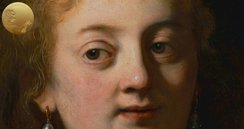
The boundary between the iris and the white of the eye is never sharp, and often lacks contrast, so excess details in the eye area was avoided. Similarly, the eyelashes are indicated only exceptionally when, being light in color and contrasting with the shadow side of the face, they can help create an effect of depth.
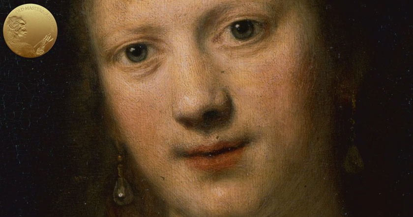
To give a realistic look to an eye, Rembrandt painted a reflected highlight on the iris in translucent paint and opposite to this, a lighter and more opaque paint was used, which resulted in vividness.
He also placed small white dots along the flesh color of the lower edge of the eye, to suggest moisture at that place.
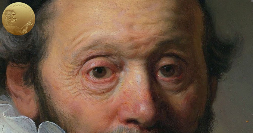
Rembrandt used brushstrokes with virtuosity, which created a rhythm and character. This dynamic approach plays an important role in his portraits. The density of brushstrokes is also varies. For example, in the center of the face, Rembrandt used a denser pattern of strokes to portray the shape, while further away, brushstrokes are more loose and sparse. Such a more abstract approach is used to depict hairs in various brown and grey colors. Ears were also portrayed with much less attention in a summary way.


