Art Lesson 14
In this lesson, you will discover the Titian’s Limited Color Palette
Learn how to paint like the Old Masters!
Old Masters Academy Online Course
Self-study, self-paced online video courseLifetime membershipOne-time payment: $487Enroll Now!Personal Tutoring online + Online Course
Unlimited tutoring by the Academy teachersLifetime membershipOne-time payment: $997Enroll Now!« Back to the Art Lessons List
Titian’s Limited Color Palette
As you remember, we have mentioned the Titian Palette – a limited set of Colors, that Titian used extensively in his paintings. We are especially interested in Titian Underpainting Techniques, and this Video Lesson reflects exactly that. We will examine his Palette as a base painting method.
Titian mostly relies on just three colors, namely – White, Red and Black, occasionally adding Yellow Ochre. He appreciated the ability to produce unique artwork using these Colors, and this fact even remains in written memories of his contemporaries.
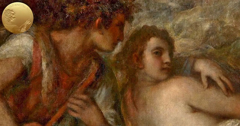
Titian did not leave any unfinished paintings behind; usually, after the death of great painters, all unfinished works, were completed by their workshop members. It was a common practice at a time. Titian himself completed paintings of Giorgione, that remained unfinished after his death, as was a case of “Sleeping Venus,” for example. But we have one curious case left to us by Turner, who was eager to understand the secret methods of the Old Masters and used Titian’s limited Palette for Underpainting in his artwork. The use of the Titian Palette is obvious in Turner’s unfinished nudes. He was under a profound impression by Titian’s “Venus” and wanted to create his own nudes using Titian’s methods and Palette. It was a very ambitious step for Turner, taking into consideration the widely admitted fact that he was… how to put it in words – weak in figurative painting. But thanks to that fact, he didn’t manage to finish what he started. These paintings were abandoned at a very early stage, and we clearly see White, Red and Black Colors in his Underpainting, in addition to Yellow Ochre, which could also be used in Underpainting. Alternatively, it could be omitted for the following layers of glazes.
The Titian Limited Palette includes:
- Titanium White
- Venetian Red
- Mars Black
- Yellow Ochre
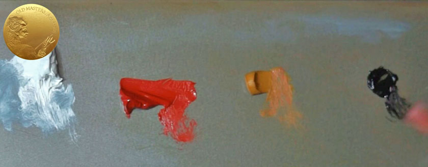
Some original Colors that were used by Titian and other Old Masters are replaced by modern pigments that preserve better. This will not affect the result in any case because the Secrets of Old Masters lie in their Methods, not in their Materials. Some modern substitutes behave better than the originals – like in case of Titanium White, which replaced Lead White. Titanium White has far greater opacity and tinting strength compared to Lead White. Let me remind you that Lead White is not only a very toxic pigment, but it is also greatly responsible for discoloration over a long period of time. Moreover, Lead White darkens with time. So, Titanium White wins over the background of Lead White. Yes, Titanium White is prone to yellowing and dries slowly; however, it’s less damaging in the long term than the darkening and discoloration of Lead. If we could only have a completely stable white pigment, we wouldn’t choose Titanium, but we don’t have any other choice aside from Titanium and Lead White, and Titanium has greater advantages over Lead White.
Let’s go back to the other Titian Palette colors. First of all, you need to prepare such support for the chart. You can find information on how to prepare the support by reviewing one of the previous video lessons dedicated to the topic. You need Worksheet #1 for the exercise. The columns on the printable spreadsheet are shifted slightly and form three groups.
Here, you can see our first complete chart. In this Video Lesson, we are going to explain the nature and practical abilities of the Titian’s Limited Palette with a simple color exercise. This set of colors, this Titian’s Limited Palette, will serve as our base Palette when we do Underpainting – the very initial layers of painting. There are just 4 Colors in the set, which creates an extremely limited Palette; but, as you can see, it’s possible to create a huge variety of color effects from it. By completing this exercise, we will easily understand the nature of each pigment and learn about their ability to mix with each other.
You know, there is such a huge potential in these few colors, that it might not be comprehensible without this exercise. Let me jump ahead a bit and show you our second chart of Titian’s Palette. You will learn about it in the next Video Lesson. We just want to show you the difference between solid, normal layers of paint (which we are going to do now), and this wonderful chart of the same pigments only in glazes – in very thin, transparent glazes. Using the Underpainintg Opaque chart, we will mix our Colors with White – you can see that each next step is tinted down to a near-white color. However, in this Glazing chart, there is no White added whatsoever – we apply thin glazes layer by layer, from almost invisible to the maximum Tone. OK, we will discuss the Glazing chart later.
Now, let’s return to the Opaque chart. Let’s have a look at the Oil Paints – they are by different brands, but do not pay attention to that; you may prefer different ones. We also have to keep in mind that the same Color with the same name could vary from brand to brand. We also need some simple brushes – Hog or Synthetic Brushes and a Palette Knife.
To simplify the process, let’s use initials for the colors: Yellow Ochre – will be Y; Venetian Red – R; Mars Black – B and Titanium White – W.
We will be squeezing Yellow, Red and Black paint onto a Palette. We are going to allocate the swatches in the following order: the chart begins with a row of pure Colors right from the tube. These three columns will be reserved for Yellow, Red and Black – we are marking them in corresponding initials. I’m making all notes temporarily over the Masking Tape. Then, we fill in the cell applying a Yellow paint opaquely. On the vertical side of the chart, you can also make some indications, showing with what consistency you have to tint the swatches; this will change the TONE of paint. With TONE, we are measuring of how light or dark a Color is. When we lighten the color by adding White, we can call such mix “TINT” through process we call “tinting.” The first horizontal row is 100% Yellow – untinted paint from the tube. The next row is – 75%; the third 50% – half Yellow, half White; then 25%, 5% and 2%.
When the first cell is filled in with 100% untinted Yellow, we are ready to Tint the paint with White. Taking more or less equal parts of Yellow and White, mix them together and apply in the section indicated as 50 %. You might question why we skip the step with 75%? Because it’s easier to create a 50/50 mix and use it as a tuning Color, and now we can adjust the 75% mix more easily – it should be equally far apart in value between 100 and 50. Then goes the 25% mix – again, you take approximately one quarter (that is 25%) of Yellow and three quarters (75%) of White; mix carefully, apply on a canvas and check that all swatches have equidistant values. 5% and 2% should be measured more or less on your intuition. We have to compare values. Check to see if 5% swatch of color is too close to 2% colors in value. If yes, adjust the Tint it by adding a bit more of White or Yellow (according to the situation).
Repeat the same process for Red – you may notice the covering power of Venetian Red is greater than that of transparent Yellow Ochre, and in a 50/50 ratio, Red dominates over White.
Then goes the Black color chart – we repeat the same process as we did for Yellow and Red; the first raw is pure, untinted Black straight from the tube. Then, we tint the color more and more with White. These three rows contain just pure Yellow, Red and Black colors tinted with White.
The next step will be mixing two of Titian’s colors in one mix; here, you can see an example of a Yellow-Red mix; we indicate the row as YR. And, we proceed as usual – the first row is filled in with an untinted mix– no White, just a half Yellow, half Red mix. In the 50% section, we take 50% of Yellow-Red and add 50% of White into the mix. Then, in the 75% section, we take 75% of Yellow-Red and add the remaining 25% of White… and so on for 25%, 5% and 2%.
The following paired mix would be: Yellow-Black (we mark it as YB)….the process is repeated as usual. OK, let’s skip the repetitive process and just have a look at the final result. That will explain everything.
What can we see on the chart? That it’s possible to create at least 12 basic Hues from Titian’s Limited Palette. Just as a reminder – this is Hue – Hue is what we usually refer to as “colour.” A Hue refers to a pure color, that is without TINT or SHADE – with no added white or black pigment.
This upper raw is 100% Hue – pure color or mixes of pure colors with no White added for tinting.
So, what Hues are here? First of all, there are pure Yellow, Red and Black colors straight from the tube. Also, we have two color combinations such as Yellow-Red, Yellow-Black and Red-Black. This group of three columns is a three colors combination – we have mixed all three colors together. However, in this first box, Yellow is dominating the mix. As you can see, a “Y” letter is the biggest letter here – it means we had 50% of Yellow and added to it Black and Red – so we have 50% of Yellow, 25% of Black and 25% of Red. In the next column, Red is dominating in the mix, and in the third one, Black is a dominant color in the mix.
All the mentioned Hues are Tinted down by adding White pigment to the almost white color.
And the last three columns have a completely different nature – there is not any White added to the mixes, no tinting, just pure color. In the first row, we use pure Yellow from the tube; then we add Black in proportions: 75% of Yellow to 25% of Black; the next step is 50/50% and so on. The last box we made of 0% of Yellow, thus Black is presented there in 100%. In such way we are intermixing three colors with each other, creating additional variations of Hues.
When the chart is complete, you can leave it for drying. It can take at least a week, as Titanium White added in mixtures slows down the process of drying. Those boxes filled in with untinted colors will dry faster. So, when you are going to check how dry the paint is, try the tinted swatches first. When the paint is touch-dry, peel off the Masking tape. But the paint still needs to be dried properly over months. In 12 month’s time, you can varnish your charts for extra protection. In the next Video Lesson we are going to learn how Titian’s Limited Palette works in thin Glaze layers.
What you need for the task:
- Worksheet #1
- Prepared Support – Canvas, Canvas Board or Oil Painting Paper A3
- Masking Tape
- Titanium White
- Venetian Red
- Mars Black
- Yellow Ochre
- Hog or Synthetic Brushes
- Palette Knife
