Art Lesson 16, Part 2
Discover Warm and Cool Colors – Transparent and Opaque Paints for Glazing
Learn how to paint like the Old Masters!
Old Masters Academy Online Course
Self-study, self-paced online video courseLifetime membershipOne-time payment: $487Enroll Now!Personal Tutoring online + Online Course
Unlimited tutoring by the Academy teachersLifetime membershipOne-time payment: $997Enroll Now!« Back to the Art Lessons List
Warm and Cool Colors – Transparent and Opaque Paints for Glazing
Now that we know how Glazings work, let’s continue with the Glazing Charts to test our Palette.
In these charts, I tested all oil paints I had at my disposal at that moment. I advise you to do the same – test all paints you have, since they could vary from mine. From time to time, if you decide to acquire some other paints, you should test them as well.

Here are a few words on the Warmth of Colors. Warm colors are located at the orange-red end of the spectrum. For us artists, it would be more natural to look at a Color Wheel or Color Triangle. On a Color Triangle, illustrating Primary and Secondary Colors, we see clearly that Yellow, Orange and Red are Warm Colors, and Green, Blue and Violet are definitely seen as Cold Colors. However, when we compare some Colors, let’s say few types of Blue among themselves, we see that they could be comparable to each other within one Hue. We see that they are related to other warm and cool versions of Blues. For example, French Ultramarine is definitely colder than other Blues.
All these nuances in Warmth and Coolness are very important in oil painting.
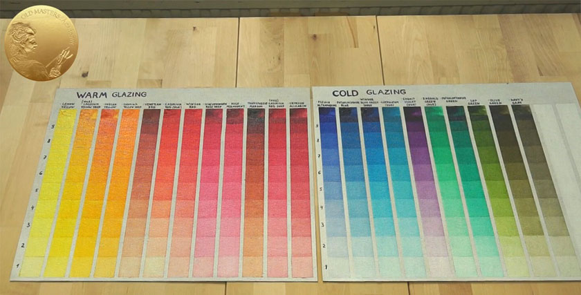
Let’s get started with creating the charts. You can use Worksheet #3 for outlines. We already know how to use them. Select all the Warm Colors you have – Yellows, Oranges and Reds, but not Colors we generally call Brown. Such Brown Earth Colors, which are also mostly Warm, form a specific group that we will test separately. (Earth Colors originate from clay Earth pigments. They include Umbers, Ochre, and Siennas). Here we have 12 columns. If you have a lower number of Warm Colors, that’s ok. You may buy some other paints later, so you could continue the Chart. And, of course, ignore the names of the Paints listed at the top as you may have a different collection of paints. That’s how the Glazing Chart of Warm Colors looks when completed. On the left-hand side, we see the number of transparent layers applied, one over another, from the most transparent one to the most intense.
Imagine that this yellowish transparent glazing layer is a lightly yellowish piece of glass. When you place that glass on a white surface, you are coloring it in a light Yellow. Then, place a second piece of glass above the first one – and you see that you are getting a bit more intense of a color. Then, follow with a third piece of glass, then a forth… and so on. That’s how thin transparent layers of Colors work.
The darker the Color is, the wider diapason of Tone it can create. I remind you that the Tonal Relationship of a Color is how light or dark the Color is. For example, in case of Venetian Red, the Tonal Diapason is wider than that of Lemon Yellow. After step 6, the Tone of Lemon Yellow is not getting darker any more; it has reached its limit. As we complete step 10, we see a narrow line of the maximum Intercity we could achieve with a Glazing technique. If you ask why you should do all this time-consuming layering and whether it would be more economical (in terms of time saving) to apply a paint in one go, opaquely. To answer this question and demonstrate the difference between Glazing effect and opaque layers, we are going to fill in the upper row of our Swatches with opaquely applied Paint. What do we see here? That Oil Paints, applied in thick, dense layers create a completely different quality of layers than Glazed layers. Colors that have transparent characteristics haven’t sufficient covering power, and white background flashes through them. Even opaque Colors can’t cover the surface in one go as densely as Glazing layers applied one after another. In case you would like to make a thin layer of paint, the Glazing method is exactly what you need to do.
So, back to the process – we have our canvas ready – we have transferred the outline from Worksheet # 3. Then, we sealed the background around the swatches’ rows with the masking tape. Then, for our convenience, we made the guide lines dividing all 10 steps of layers. Draw the guide lines on masking tape more conspicuously than you would on a white support. Such subtle indication lines would be enough to guide us. For the Glazing method, we have to choose the medium to dilute the paint. My advice would be to choose Liquin Original – it increases the time of drying, which greatly helps us. Imagine we are going to make 10 thin Glazing layers, one over another. And as you remember, each new glazing layer should be applied over a completely dry previous layer. Well then, we have prepared (have squeezed out from the tubes) all Warm Oil Colors we want to test, from lighter to darker colors – from Yellow to Red. Please note, in this Lesson we just show an example of how to test Warm and Cold Colors on their behavior in thin layers. We have not recommend these Colors. You can use Hog or Synthetic Brushes for this exercise. I chose one small Synthetic Brush and a Wide Flat Synthetic Brush for smoothing out the glazing layer.
Fill in the uppermost box with the pure Color from the tube (with no Liquin or any other medium added). Apply the layer thickly to have a proper Impasto mass of paint, and gradually reduce the thickness of a layer. Cover the rest of the box, spreading the Paint thinly. Looking at the upper row, you could always check how each paint appears in Impasto layers and how strong or weak the covering power of the Color is. It’s not enough to check the tube’s information on the subject of transparency – when you see your tests of the Color – that gives you a deeper understanding of the Color.
Now, we will proceed with the Glazing layer itself: Place a dab of Liquin on a palette. Remove excess Paint from the Brush, and add just a bit of Paint to the Liquin. You have to judge on a hunch how much Liquin should be added to the mix. As a result, we have to get a very delicate, transparent Yellowish Color. Apply it along the whole column.
Then, smooth out the wet layer with a Wide Flat Synthetic Brush. We should repeat the same process for the rest Colors you have at your disposal.
In this Chart, I have tested 12 Warm Colors. Not all of them are on the recommended Oil Paints List. I just tested all the Paints I had in my studio at that time. I do not use some of them anymore for various reasons – either they are not reliable from a preservation point of view, or they are not aesthetically preferred. So, do not be mislead by the Colors presented here. Just grasp the idea of how to make the Glazing tests of your Palette.
Gradually, we fill up all columns with the first layer of Glazing. And, of course, the upper row was reserved for an opaque application of a Color.
At this stage, we are done. Now we have to leave aside the Chart to wait till it’s completely dry. Liquin will exhilarate the drying time; but, anyway, Oil Paints take time to dry, even if we use so-called “siccatives,” which are oil drying agents.
This chart could be already touch-dry the next day because we have added a relatively large amount of Liquin in proportion to Paint and applied them in a very thin film. Despite that, I would recommend waiting at least three days to let them dry throughout. If the layer of Paint is not properly dried, the next layer can wash it off.
This part – with Glazings will dry faster than this upper row with the Impasto paint, which could take an average of about 7 days.
In a few days’ time, when the first Glazing Layer is dry, we proceed with a second glaze layer, leaving the first step of the column untouched. And so on. Before applying the successive glaze, we have to be sure that what we apply is on a completely dry surface. At the end, we get such beautiful visual representation on how Colors behave in Glazes, in thin transparent layers.
We should test the Cold Colors on the same principle as we tested the Warm Colors. Lay out the Cold Colors from Blue and Violet to Green on your Palette. Add Liquin Original as a medium to make the Paint transparent.
This is how the completed and already dried Chart looks. Again, these paints are not from a recommended list of Oil Paints. All these tests were done with all the paints I had at that time at my disposal. Just few of them are now on my recommended List of Oil Paints. The Cold Colors list is shorter than the Warm Colors list. If I decide to top up my Palette with some new Cold Colors, I will continue this chart. However, I think I have a sufficient Palette now, with all Paints tested on endurance. Now, I do not purchase new paints under an emotional attachment to the aesthetic color look without researching the strengths and weaknesses. I think that less is better as opposed to an excess stock of Colors.
So, what have we here? What else can we understand from these charts? We can compare all Colors of one Hue with one another. For example, we can examine how similar or different the Colors of Red Hue are when compared to each other. We can assess how Warm or Cold they are, relative to each other. Yes, the Red Hue itself is Warm, but relative to each other, they could differ significantly, as Cadmium Red (hue) is much warmer to a degree than Alizarin Crimson. Also, without referring to the label on the tube, we can see that Cadmium Red is an Opaque Color with a greater covering power than the same Alizarin Crimson. The covering power is clearly visible here, in a box filled in with undiluted Paint. Cadmium Red easily covered the white background, unlike Alizarin Crimson, which is too transparent to properly cover the white background by itself. We can compare a very identical Cadmium Red and Winsor Red in their undiluted state, when they are pure, just from the tube. However, when they are applied thinly, we can see a subtle difference. One is more orange than another.
Aside from Warm and Cold Colors, the very important place in essential Oil Paints is reserved for Earth Colors and Black Colors. See the following Video Lessons for more info.
What you need for the task:
- Worksheets #3 and #4
- 2 pieces of Prepared Support – Canvas, Canvas Board or Oil Painting Paper A3
- Masking Tape
- All Warm and Cold Oil Paints you want to test
- Hog or/and Synthetic Brushes + Wide Flat Synthetic Brush for smoothing
- Palette Knife
- Liquin Original


